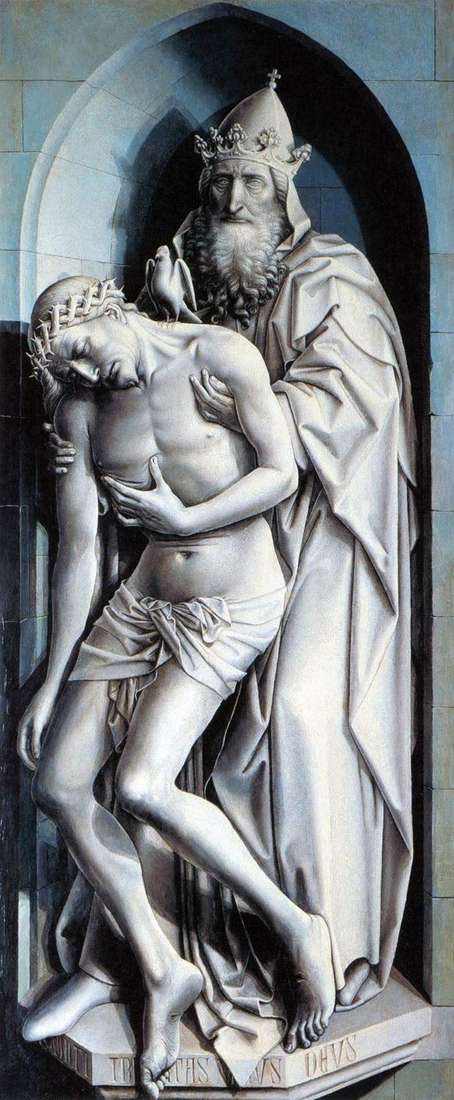
The part with the image of the Trinity is as remarkable in concept as the composition with female figures. This is one of the oldest, if not the earliest, sample of grisaille, imitating a stone sculpture on the outer section of the altar. The idea was not only that the closed side of the altar created the illusion of merging with the church wall behind it, but also that it should turn out to be an internal, subordinate image, emphasizing the contrast with the rich colors of the wings opening on holidays. There is also an interaction between illusion and reality.
Like unvarnished stone statues statues are installed in niches on polygonal pedestals; the sunken pupils of God the Father are slightly turned to the right according to the perspective of the niche, the view of which also falls to the right. Sculptures are extremely believable; while the reality of their outlines creates the impression that they have come to life thanks to the colors covering them. It seems that the dead Jesus still demonstrates his wound in the side.
The hidden meaning of this scene is the realistic transfer of the theme of Pieta. The shadow and penumbra, created by the bright light from the window on the right, exacerbate the realism of the work. The sculptures of Claus Sluter, who worked in Dijon and created his famous predecessor Andre Bonev in Valenciennes, are close to this work with their tangible three-dimensional space; Kampen must have seen them. The work of the master is written in grisaille on thin flax, fixed on the board. The same design has other pictures on the outer sides of the altar flaps, perhaps for their protection during the opening from the dampness of the church walls.
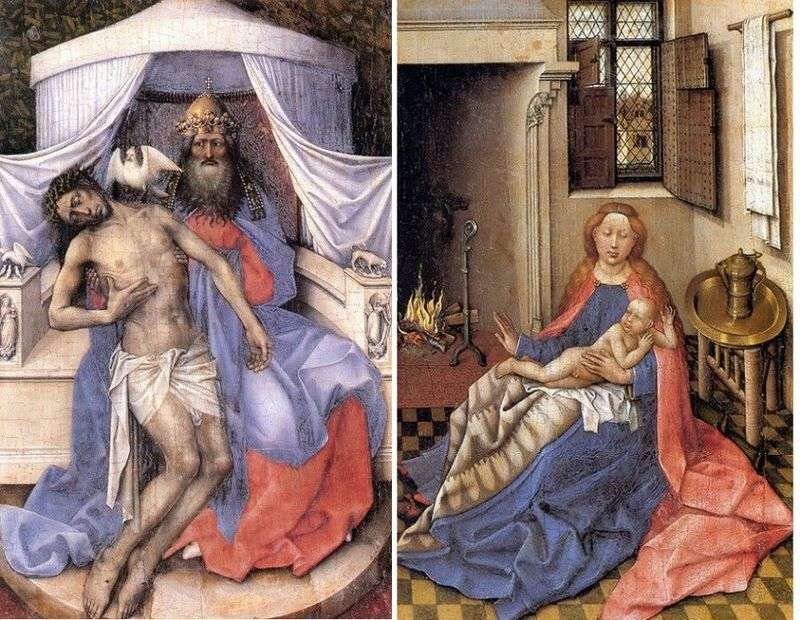 Trinity. Madonna and Child (diptych) by Robert Kampen
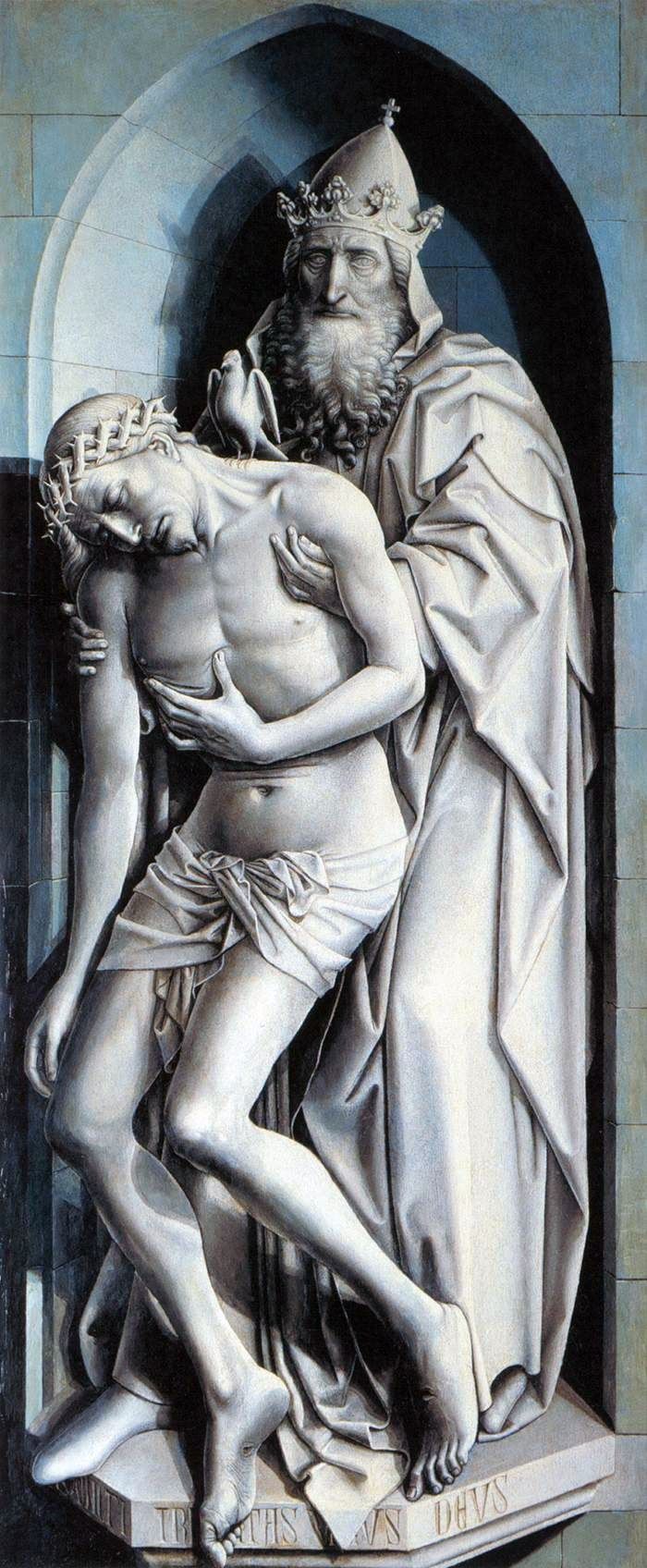 Trinité – Robert Kampen
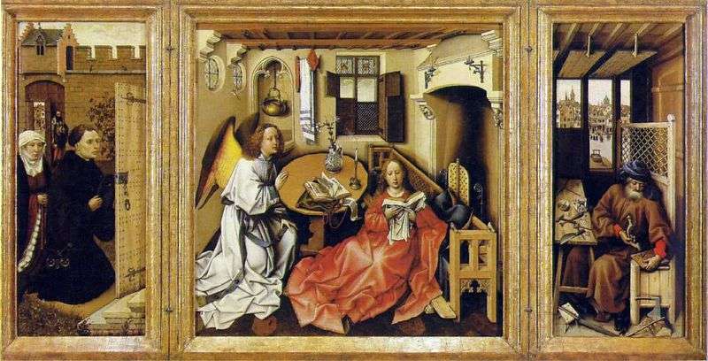 The Annunciation (Altar of Merode) by Robert Kampen
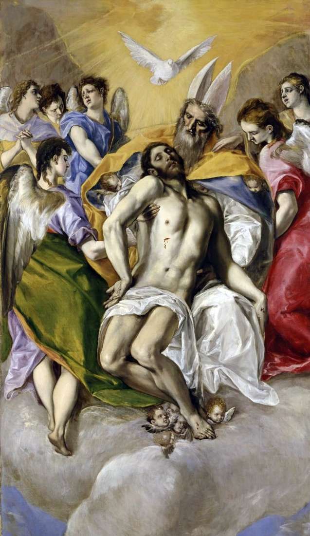 Holy Trinity by El Greco
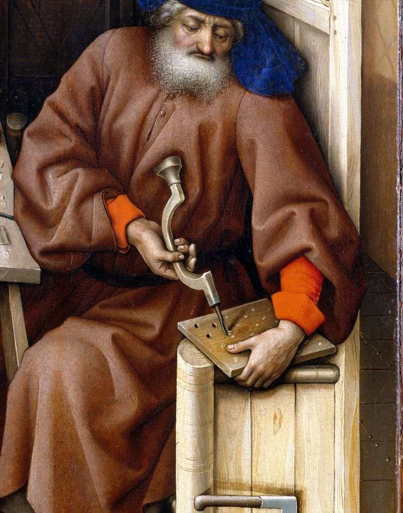 Triptych of Merode. Right wing by Robert Kampen
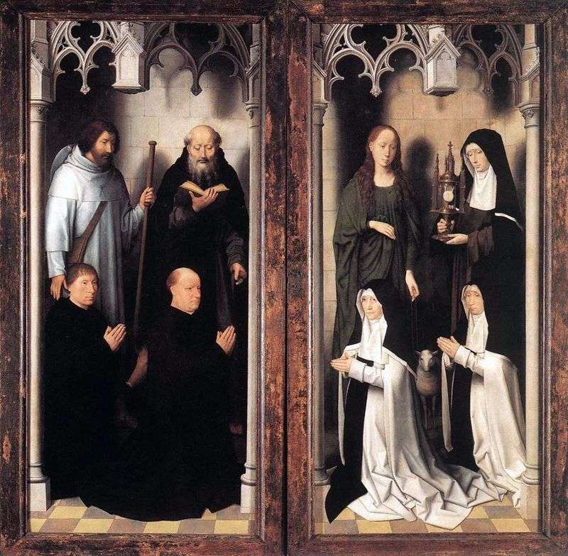 The altar of the two john. External doors by Hans Memling
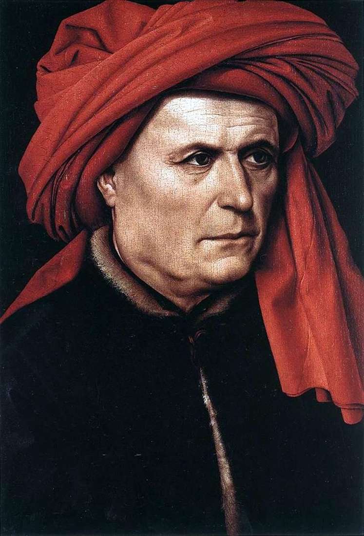 Portrait of a man by Robert Kampen
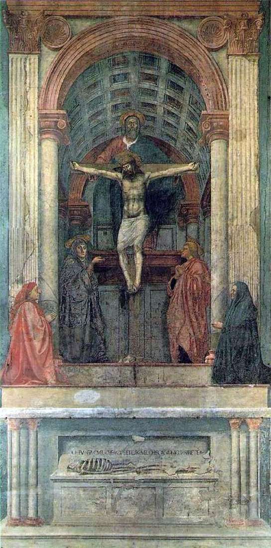 Trinity by Masaccio