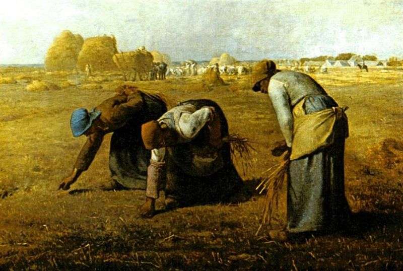
The painting depicts three peasant collecting remaining after harvest spikelets. In 1857, when the painting was shown at the Salon, farmers were seen as potentially dangerous, revolutionary force. By 1914 Mille masterpiece already began to perceive differently – as a symbol of French patriotism. He was even reproduced on posters calling to join the national army. Today many critics, while recognizing the intrinsic value of the picture, find it too sentimental.
Declination peasant figures resemble classical fresco. The outlines of the figures echo the stacks of bread in the background, which stresses the insignificance of what got the share of these poor women. Images Millet inspired many artists, marching behind him. Like Pissarro, Gauguin and Van Gogh, Millet was looking for in the ideal of peasant life of the patriarchal world, not yet infected pernicious breath of civilization.
They all thought about running away from the city to the harmony of village life. In the 1850s, these preferences are not too welcomed – firstly, the peasant masses was seen as a source of revolutionary danger, and secondly, many people do not like the fact that the images of ignorant peasants rose up to the level of national heroes and biblical characters.
This rural theme was quite prevalent in contemporary art, but the peasants in a tradition of depicting or pastoral, or, on the contrary, ironically. The situation changed with the advent of the Impressionists and Post-Impressionists. In particular, Pissarro was always interested in the realities of everyday peasant labor, and Van Gogh farmer always embodied the modern society lost the simplicity and spiritual elevation.
The artist began with a pencil sketch, then began to apply the basic colors. At this stage, the work he used strongly diluted paint – Prussian bluing and titanium white for the sky, raw umber for stacks, and raw umber, with the addition of Karmazin and whiting, for the field. To write peasant clothes were taken Prussian blue for a handkerchief, indigo for the skirt and red Winsor armlets and for another handkerchief.
The main color of the sky for our artist used the Prussian bluing, put it on top of mauve clouds, painted crimson and white. The left side of the sky lit flares yellow ocher. For land needed sophisticated color derived from burnt umber, burnt sienna, crimson, cobalt blue, green and cobalt oxide. As the sky, the artist imposed increasingly dark layers of paint where it was necessary to portray the bumps on the surface of the earth. This had to follow closely the black outlines, keep drawing.
Next, the artist took up the scene around the stacks in the background. He recreated it in parts, gradually deepening the color of complex shapes and figures. Rick painted yellow ocher, with the addition of the dark areas of raw umber; distant figure – Winsor red paint, indigo, Prussian methylene blue and white. Skin Tone up of burnt sienna and white lead.
In the last step our artist returned to painting figures of the main characters. He deepened the dark folds of clothing, and then add the necessary tone, repeating this process until such time until the desired color depth has been reached. After that the artist painted highlights. To the left was taken shape Prussian blue ; for the dark areas of her face and neck – with the addition of raw umber burnt umber and black paint; for the skirt – Prussian blue with the addition of indigo; Hand – burnt sienna and raw umber. Red color on the right figure Winsor written in red ink, mixed with burnt sienna and yellow ocher; blue collar – Prussian and methylene blue whiting; undershirt – Prussian methylene blue, raw umber and whitewash with the addition of Winsor red paint; blouse – whitewash, partially shaded raw umber and Prussian methylene blue; Skirt – Prussian methylene blue mixed with burnt sienna.
Much depended on how skillfully executed glare. For example, a white shirt to create the effect of the background haze. This highlights the intensity brings a sense of depth, making three-dimensional figures. Without this, the image would look flat.
The richness of the colors on this site painting achieved not so much by the addition of new layers as by treatment already imposed paint. Our artist worked his fingers, smearing paint or removing it from the canvas. Remove excess paint is already used here is more important than adding a new one!
 Angelyus (Evening Prayer) by Jean-Francois Millet
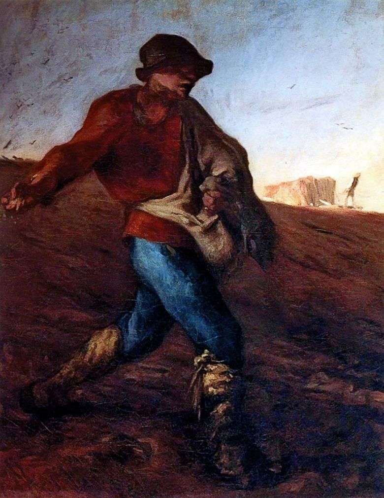 The Sower by Jean Francois Millet
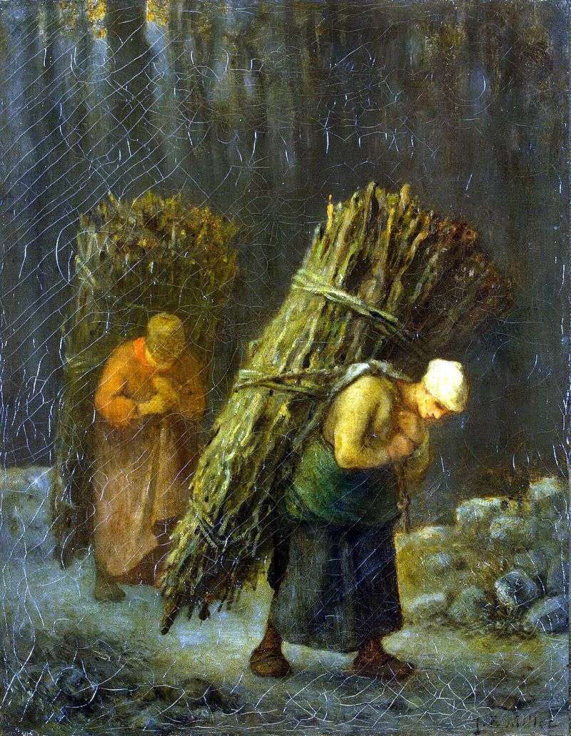 Peasant Woman with Brushwood by Jean-Francois Millet
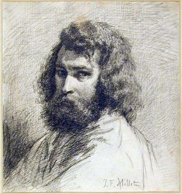 Self Portrait by Jean Francois Millet
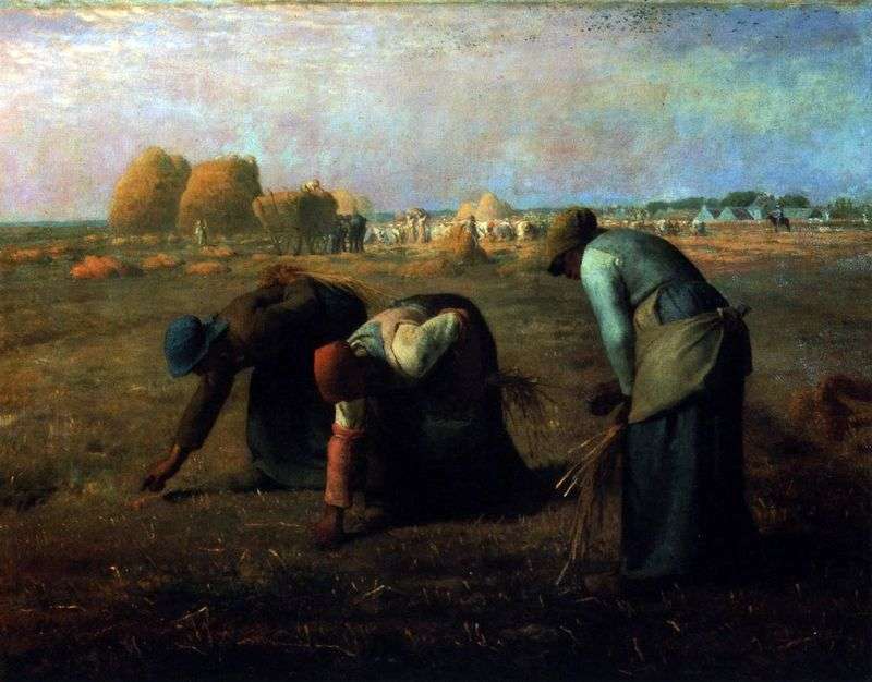 Collector of ears of corn by Jean-Francois Millet
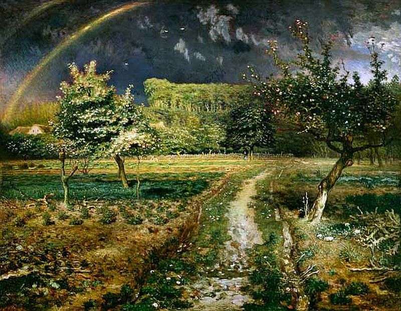 Spring by Jean Francois Millet
 Rassembler les oreilles – Jean-Francois Millet
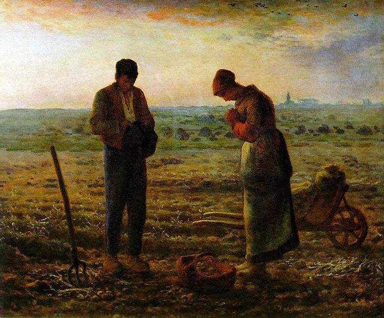 Angélus (prière du soir) – Jean-Francois Millet