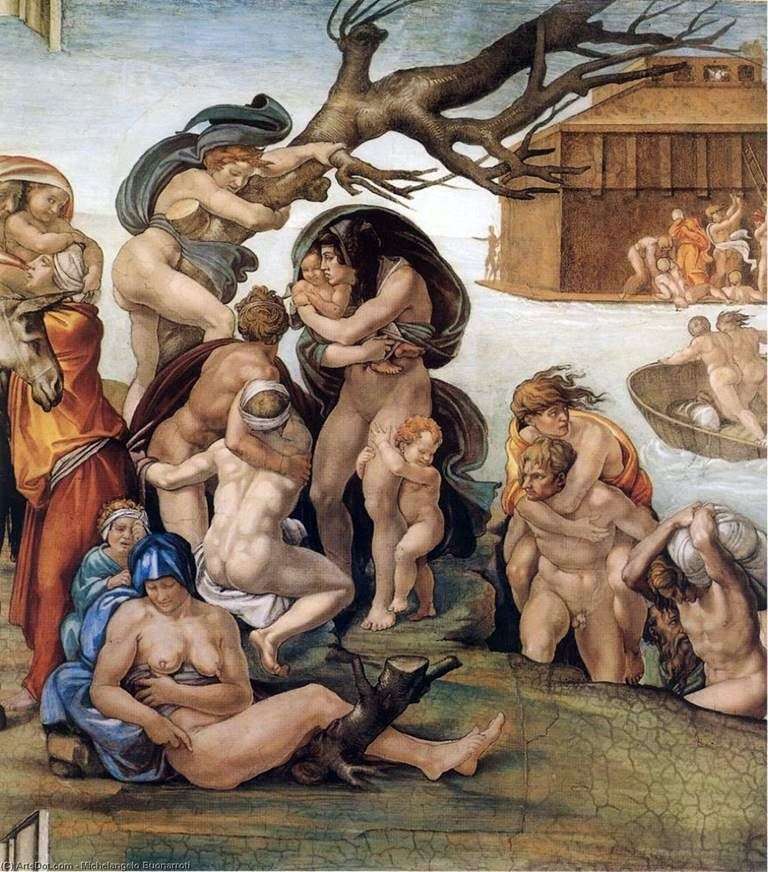
The Flood, fresco by Michelangelo Buonarroti, a fragment of the Sistine Chapel mural. In the sistine ceiling Michelangelo came to the full maturity of his skill. In the overall composition of the ceiling, he solved the most difficult task, finding such an architectonic segmentation, which, despite the abundance of figures, made it possible to achieve not only a logical sequence of images and clear visibility of each of the countless figures separately, but also the impression of the decorative unity of the giant mural.
In accordance with the principles of monumental painting of the Renaissance, the painting not only does not destroy the architecture of the vault and walls, but, on the contrary, enriches it, revealing its tectonic structure, enhancing its plastic palpability. In the painting of figures, the plastic principle dominates completely – in this respect, the frescoes of the ceiling serve as a vivid expression of Michelangelo’s words: “The best painting will be the one closest to the relief.”
Michelangelo’s pictorial language over several years of work in the chapel underwent some evolution: the later figures were larger in size, their pathetic expressiveness increased, their movement became more complicated, but the increased plasticity characteristic of Michelangelo, the chased clarity of lines and volumes remained in them to the full. And although Michelangelo gave an example of the skillful use of color in the painting, in general, the images of the Sistine ceiling seem more likely to be sculpted by the sculptor’s powerful hand than by the painter’s brush.
 Detail of the Sistine Chapel painting (fresco) by Michelangelo Buonarroti
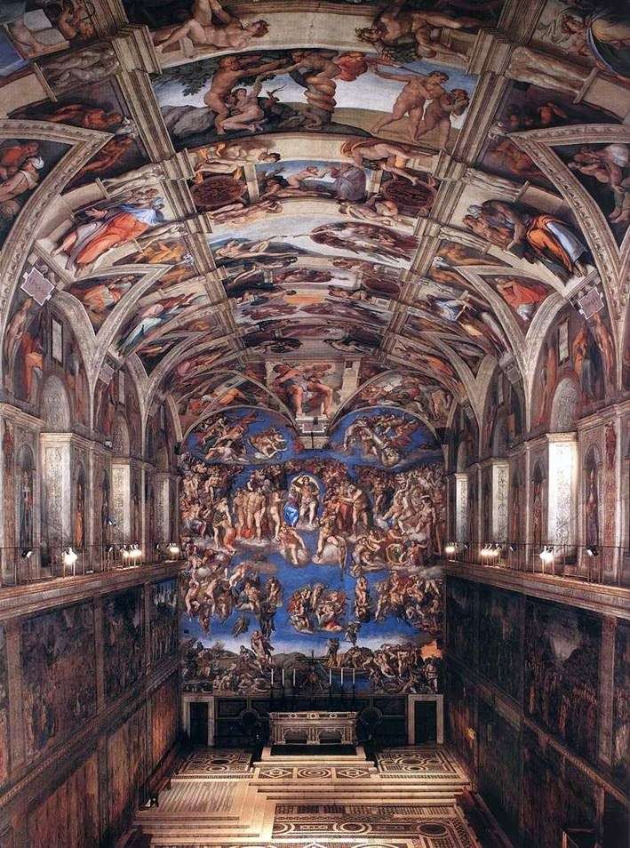 Interior of the Sistine Chapel by Michelangelo Buanarrotti
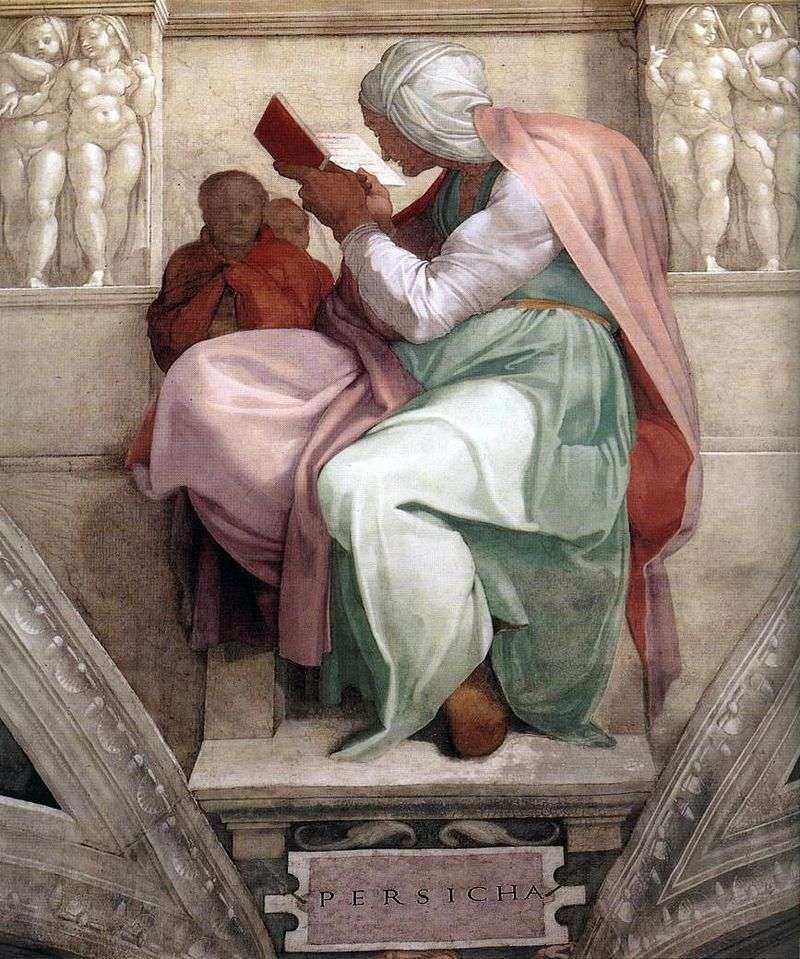 Persian Sibyl (fresco) by Michelangelo Buonarroti
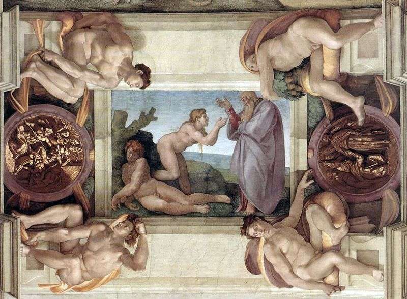 The Creation of Eve by Michelangelo Buonarroti
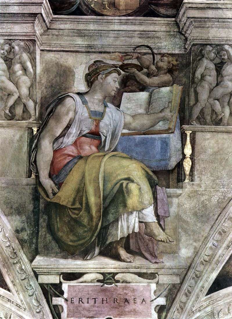 Eritrean Sibyl (fresco) by Michelangelo Buonarroti
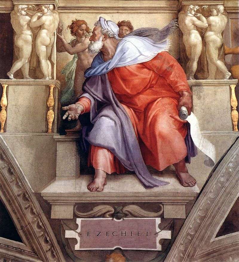 The Prophet Ezekiel (Fresco) by Michelangelo Buonarroti
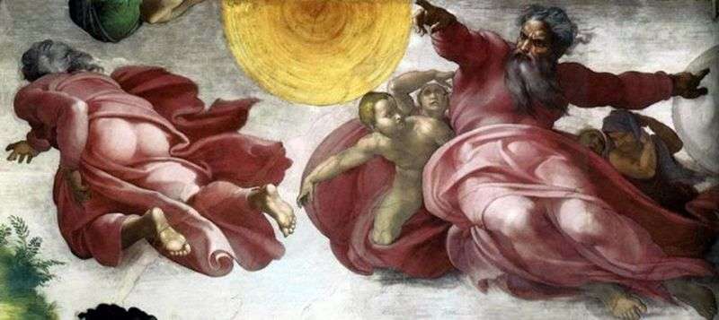 The separation of light from darkness by Michelangelo Buonarroti
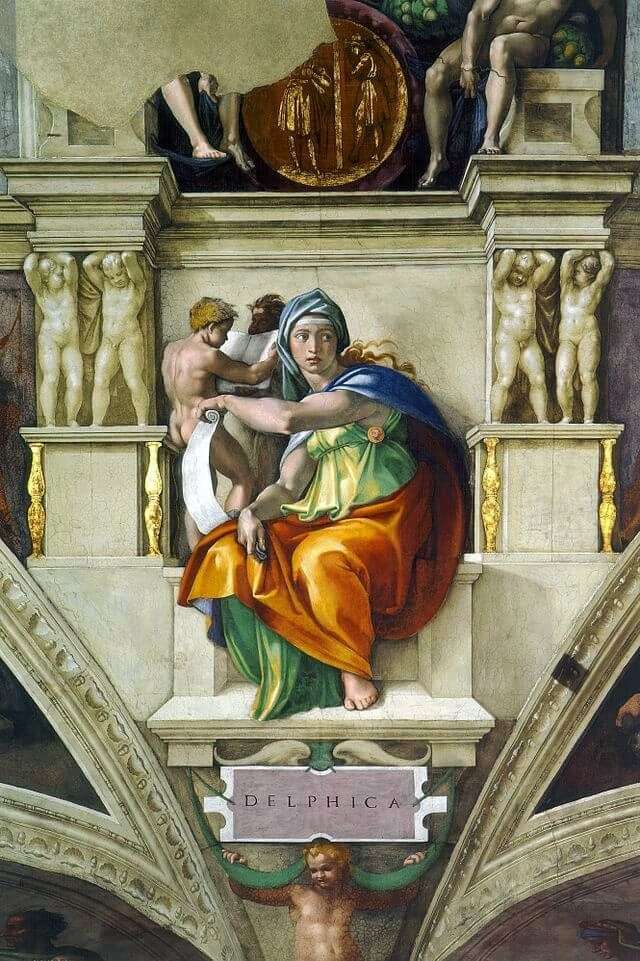 The Delphic Sibyl by Michelangelo Buonarroti Buonarroti